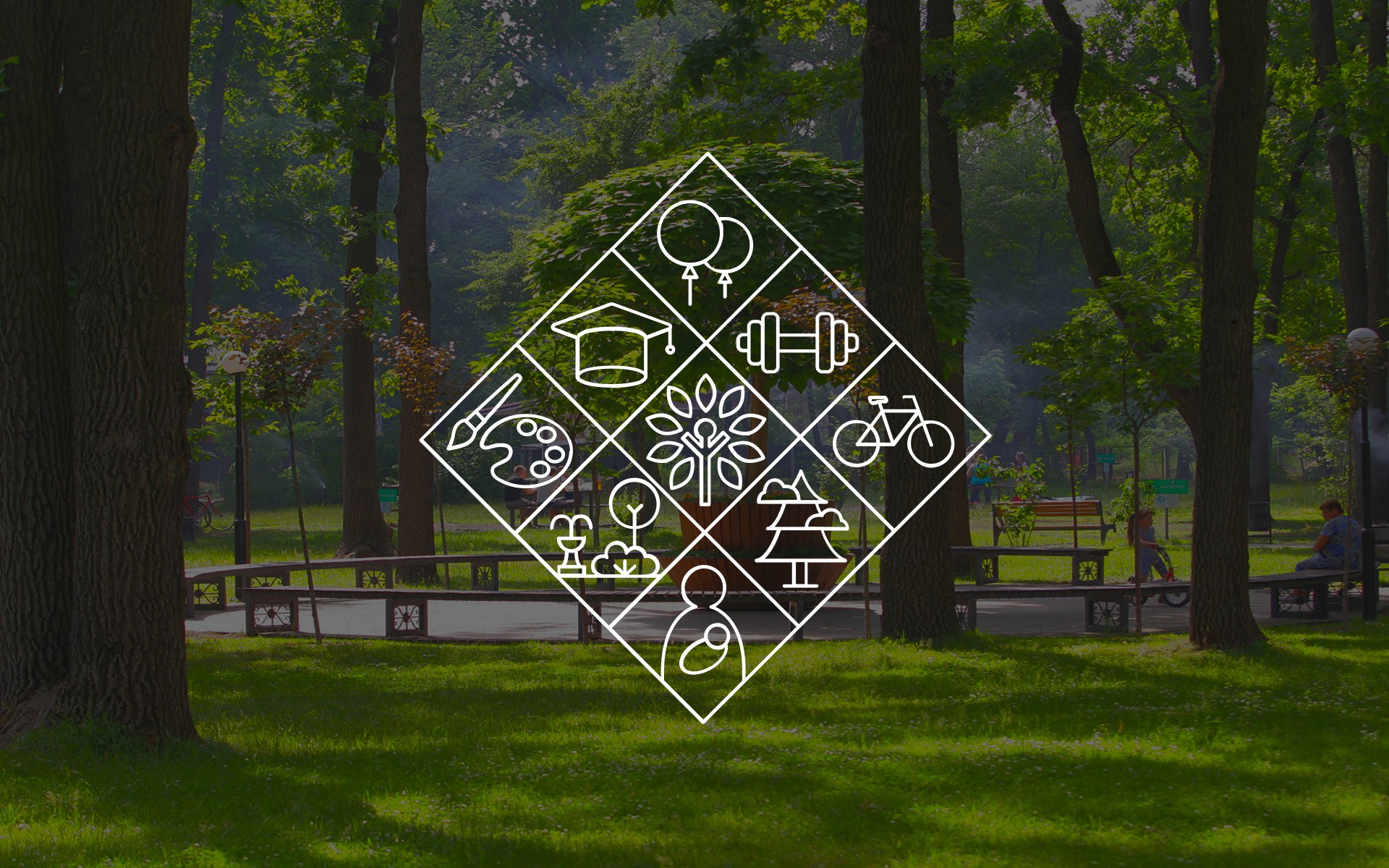
Irpin City Branding
A comprehensive rebranding and urban design initiative created with city administration to modernize the identity of this vibrant, family-oriented town. We developed a unified "design code" and a visual system centered on a Slavic rhombus logo - a symbolic amulet representing the community. The project extended into a full digital ecosystem, including a tourism portal, investment site, and 37 institutional websites for local schools.

OST WEST LOGISTIC
This is a kind of file binding design that can help people understand depression. With the degree of depression, the appearance and pattern of each document will become more chaotic and torn.

NT.PAYMENTS
Points define our perceptions—pupils are points, the world is a point, and even one dimension is a point. Our eyes, our pupils deceive us. Thus, I utilize gradients to fabricate relationships of depth, foreground, and altitude, crafting an illusion of visual fallacy.

KVARTAL STUDIO
The main visual consists of handwriting lines left by people The main visual is composed of handwritten lines left by people. When people buy pens, there will be traces of their testing on the paper beside them. These handwritings are the most natural expression of the pen.
aw2
The main visual consists of handwriting lines left by people The main visual is composed of handwritten lines left by people. When people buy pens, there will be traces of their testing on the paper beside them. These handwritings are the most natural expression of the pen.